Pages

Friday, August 31, 2012

Back to School in La La Land


This week at La La Land Crafts we are heading back to school. I find this a bit strange as here in Australia our school year is nearly 3/4 over - LOL. Our kids start a new school year after our long Summer holidays over Christmas.

I wanted to make a little backpack so went in search of a tutorial and found THIS one for a backpack mini album - such a cute idea! I did change some of the imstructions and the measurements slightly to suit my needs - my backpack is 1/2" wider that the one in the tutorial and the front pocket is only for show and doesn't open.


When you open up the backpack you can see all of Luka's stationary ready for use!


Inside the album there are 8 pages. I've used some school based DP from Fancy Pants Design to decorate my pages - I just need to add in some photos and embellishments to finish it off - although my son is 14 now so I may gift this to someone who will appreciate it - LOL


The back of the pack has some cord straps to finish it off.

La La Land Products - 

Copics Used - 
Skin - E21, E11, E000, R20, R11
Hair - E44, E43, E42
Clothes - BG57, BG53, BG49, C8, C6, C5, C4, C0, Y28, Y26
Apple - R46, R43, G24, E44
Skateboard - 100, C6, C4, R46, R43
Ruler - E43, E42

Tuesday, August 28, 2012

Colouring with an Iron On


A while ago I saw some cute T-shirts appearing around FB with iron-on images using digi stamps. I had it in mind to make something for my great niece when she was born last December but never got around to it! Recently I saw Trudie's fabulous new tutorial on how to do this with wonderful hints and tips HERE and I was all inspired again to give it a go. I bought a little white tee and purple short set to play with from K-Mart. 

I used Mo Manning's gorgeous new ballerina image Odette to play with - I figured I could get away without too many strong colours on my first attempt at this technique! I found a quote I liked to add as the sentiment and used WordArt to add it to the image before printing off - and like Trudie says - make sure you print off your words backwards so they are the right way round once you've ironed on your image!!!


And here she is close up - there are a couple of spots where the colour bled past the lines but that just adds to the hand coloured effect - well that's what I'm telling myself anyhow - LOL. Also I found the blending isn't as smooth as when you use blending paper - but that just adds to the challenge.

I painted on some Jo Sonja Opal Dust for some glitter - this works well on fabric but I did have to grab the hair-dryer out so my copic ink didn't bleed as it was quite wet going on - and make sure you have something sandwiched between the front and back of your tee to stop any unwanted marks going through.

The one thing I hope is that my iron on media has the same qualities as the one Trudie used as there are several different ones on the market - in particular I hope it stands up to washing - I guess time will tell...

Copics Used - Skin (E21, E11, E000, R20, R11) plus V17, V15, V12, V01, V0000, E35, E33, E31, E08

Sunday, August 26, 2012

Magnolia Down Under Challenge #161


This week at Magnolia Down Under Challenges we are asking you to be "All Stitched Up" - so use real or faux stitching on your project. I haven't pulled my sewing machine out for a while so once I did I decided to go a little crazy and do some free-arm stitching to add texture to the background of the circular panel. I then sat Tilda doing her own bit of sewing in front of it. I also stitched the edges of the other panels.

The DP I used is designed our very own MDUC teamie Denise and is available from Meg's Garden. The chipboard elements I used - (the bird and birdcage, and Tilda's seat) - are from Scrapmatts.

Don't forget to check out the rest of the amazing inspiration from the MDUC DT on our BLOG.

Copics Used - Skin (E21, E11, E000, R20, R11) plus E57, E55, E53, YR31, YR30, R24, G24, T4, T0

Friday, August 24, 2012

Make It Crafty Tutorial Release Blog Hop

Zoe's excited to be releasing another colouring tutorial and it is on a topic that everyone always seems to want to improve... 'Colouring long hair in fine detail!'
Colouring Long Hair Tutorial
When Zoe was trying to decide on an image that would be perfect for this tutorial she just knew she had to contact the gorgeous Krista Smith from Saturated Canary. And... excitingly Krista has illustrated and generously donated the perfect character exploding with big luscious hair full of layers and bumps! Just perfect for you to learn all of Zoe's little secrets to colouring finely detailed hair.

We thought it would be fun to have a little hop (and a few give aways of course) where the fabulous MiC girls and Krista have followed Zoe's tips and tricks to colouring long straight hair.


The major thing to remember is - we ALL colour differently and once you've popped your image onto some pretty papers and embellished it everything looks a little bit different and the overall effect is what you want on your finished project - so don't be discouraged - we're all on a constant learning curve.

I know mine doesn't look anything like Zoe's - although there are glimpses of single strands if you look really close. The main thing is I tried it out and it is a technique that requires practice practice practice. I need to lighten my heavy handed approach to the "flicks" so I don't end up blending what I have done to soften the look. But at least by trying I know what I need to concentrate on next time!

Here is the hop list in case there are some broken links along the way.....

  1. Alyce
  2. Debbie {ME}
  3. Franz
  4. Sheila
  5. Krista
  6. Delphine
  7. Sandie
  8. Julie
  9. Ruby
  10. Tracy
  11. JennD
  12. Zoe

Copics used - (I have gone for different colours to Zoe)
Skin - E21, E11, E000, R20, R11
Lips -  R24, R11
Hair - 100, E29, E08, YR04, YR00
Plus - W5, W3, W2, G24, G21, G20, R39

DP is designed by my friend Denise Ann and available from Meg's Garden (mini papers)

Buttons and Bows in La La Land


This week at La La Land Crafts we are using buttons and bows on our creations. I had this idea to use the Carousel svg cut file from LLLC and turn it into a stage for Ballerina Marci. Once I started I thought it would be pretty cute to set up a little chorus-line of Marci's - and I must admit I'm pretty happy with how it all turned out. I didn't use the decorative panels from the carousel cut file as I thought it would look more like a stage without them.

I used a die to create my bow and centre a button in the middle, and then created a sentiment/sign for my little ballet class.

Don't forget to check out the rest of the fabulous inspiration from the LLLC DT on our BLOG.

La La Land Products -
Ballerina Marci
Carousel SVG File

Bow Die from Lil Inkers Designs

Copics Used
Skin - E21, E11, E000, R20, R11
Clothes - R22, R20, R00, R000, W3, W2, W00
Dark Hair - E57, E37, E35
Medium Hair - E35, E33, E31, E08
Light Hair - Y21, E53, E33, E11

Thursday, August 23, 2012

Time for Some Christmas Fun


With September fast approaching I hate to say but there have been Christmas decorations starting to appear in some of our shops - aaaaagh! I must admit it gave me a scare and made me realise it was time to start making my Christmas cards! Of course Mo Manning's adorable ornament elves have always been a favourite of mine so were the perfect place to start. This little guy is Little Elf Finn.

I've framed him with a lasercut chipboard clock from Scrapmatts and I used the clock hands to embellish the bottom corner. The red branches are also from Scrapmatts and add a fun dimension to my project.

Copics used - Skin (E21, E11, E000, R20, R11) plus E44, E43, E42, E40, C2, C00, R39, R27, R22, G28, G24, G21, G20, YR27, Y35


Monday, August 20, 2012

Mo Manning's Parade

I just love this little gal, she's by Mo Manning and is called Waiting for the Parade. With the recent Olympic Games we've seen a lot of flag waving and excited kids and it just seemed like a fun time to colour her up while I was still in the groove. I paper pieced the doll's flag and pinwheel and cut a matching 3D mini pinwheel  using a die from Lil Inker Designs to embellish my card. 

Copics Used - Skin (E11, E00, E000, R20, R11) plus B97, B34, B21, R85, R39, R27, YR31, E50, E33, E31, C2, C0, C00

Friday, August 17, 2012

Yellow, White and Grey in La La Land


This week in La La Land we are using yellow, white and grey to work with. When I saw the colour combo it reminded me of the colours of my children's primary school uniforms so I decided to create accordingly. I have also been wanting to give the "no lines" technique another outing. The softness this technique gives the image is so worth the extra effort it takes to colour - it's amazing how much we rely in those dark lines for guidance and to differentiate between the areas. To achieve this look you need to use a pale ink for stamping or - if you're using a digi image - you have to edit the colour of the lines to a light grey before printing.

Don't forget to check out the La La Land Crafts Blog for more amazing inspiration from the DT.

La La Land Products
Heart Tree Die (used as a doily)

Copics Used 
Skin - W2, E11, E00, E000, R83, R20, R11
Hair - E43, E42, E41, E40
Clothes - W7, W5, W3, W2, W00, YR23, Y19, Y11, Y08
Bag - E43, E42, E41, W5, W2, W1
Apple - G24, G21, R27, R22, R17

Birthday Boy


As soon as I saw this cutie from Make it Crafty I knew he was a "have to have". I really need more fabulous boy images in my collection and he is just fabulous - I love the way he seems to be popping out of the page. His name is "Peter Peek-a-Boo" for obvious reasons. He reminded me of the way I used to hide away when it was time for people to sing Happy Birthday to me - I even ended up under the table in tears on occasion - LOL.

I have been wanting to make one of these candle cards for a LOOOOOONG time and was amazed how easy it was - although I had to change the candle box dimensions to fit my novelty candles. 

And here he is with the candles in the "cake". A little trick - a couple of the holes I cut for the candles were too big to hold the candle up straight - so I squeezed some Tombow mono multi glue (in the green and white bottle) into the holes and let it dry. This glues dries clear but tacky so it adds a bit of grip to keep the candles in place.


You can find the tutorial for this style of card HERE.

Make it Crafty Image - Peter Peek-a-Boo

Copics used - Skin (E11, E00, E000, R20, R11) plus E19, E08, YR07, YR04, YR02, B97, B34, B32, G40, G28, G24, G21, G20, R39, W2, W1, W00

Thursday, August 16, 2012

Mo's Dream Team Blog Hop


This month's theme for our Dream Team Blog Hop is brought to you by the fabulous Pops - and her Blog is the start of all the fun. Pops is asking us to use "Summer Tones" for our creations. If you are already hopping along you should have landed here from Alice's Blog.

Luckily for me the Summer fashions are just starting to appear in the shops as we head towards our Aussie Spring and I've noticed pastels seem to be the order of the day! So I decided to take my inspiration from that colour palette. I chose one of Mo's ADORABLE 3 Baby Fairies to use - these cuties in their skimpy little outfits are perfect to depict a hot Summer's day in the garden.

And now it's time to hop on over for some more fun in the sun on Mina's Blog.

Blog Hop order (links can be found under Mo's logo on my left sidebar)
Pops, Jak, Gretha, Kerttu, Jane, Julie, Debby.Y, Heidy, Alice, Debbie,Mina

Copics used - Skin (E11, E00, E000, R20, R11) plus V01, V0000, RV63, RV10, RV00, RV000, Y21, Y08, Y000, E53, E33, YR31, YR30, G28, BG0000

Wednesday, August 15, 2012

Tickled Pink Stamps is Sponsoring ABC Challenges


This week Tickled Pink Stamps is proudly sponsoring ABC Challenges where this week "V for Vanish" - there needs to be something hidden on your creation. 

I decided to hide away my sentiment and used Lil Hauts Ghost Willow on the front. The card is a gate fold card but when you open it up the "curtains" open up the the circle and the missing sentiment appears. I know this type of card has a specific name but can't think of it for the life of me!


 Here you can see the sentiment appearing as the card opens and the "curtains" are drawn.
And here you can see the sentiment is revealed now the card is fully open. And there's a spot to write a message below. It was so much fun to create something a little different and my son is having a heap of fun opening and closing it - nice to see him admiring my work for a change - LOL.
Copics Used - Skin (E02, E000, R22, R11) plus E44, E43, E42, E41, E40, B06, B05, B02, B00, B000, B0000 

Monday, August 13, 2012

Framing Mini World Magnolias with Scrapmatts


When I saw these gorgeous layered frames from Scrapmatts I just KNEW I wanted to use one of them with some Mini World Magnolias and how cute do they look sitting on the ledge?!?!?! The frames were easily coloured with copics, white ink and a gel pen to give each section definition - and a small piece of DP was added to the base piece before the rest of the frame was put together.

And now for a cheeky trick I used - I didn't have enough of this DP to cut out the backing piece for the frame as well as for the card back so I worked out my layout and cut a piece out - if you pull everything off the front of the card you would find a rectangular hole hidden by the flowers, frame and doily! I often do this sort of thing with the backing card - cutting out a matching shape with my nesties to frame and image.

Copics used - Skintones (E11, E00, E000, R20, R11) plus E44, E43, E42, E40, R89, R85, R83, R81, C5,C4, C2, C00, B97, B34, B21, G24

Sunday, August 12, 2012

Magnolia Down Under Challenge # 159


This week are Magnolia Down Under Challenges we are asking for a card and matching gift tag. I decided to play "cat and mouse" with my pair - though I'm not sure the cat is too interested in the mouse Tilda is holding, he seems quite relaxed -  LOL.

For my card I used some Magnolia DP and dies - the snowflake, fence and tree. I embossed some windy swirls into the background behind Tilda to make sure her hair blows about ;-)

For my gift tag I used similar elements with the adorable Magnolia Cat. There is space on the back to add a message. Don't forget to check out the inspiration from the rest of the amazing MDUC DT on our BLOG.

Copics Used - Skin (E11, E00, E000, R20, R11) plus B97, B34, B21, W7, W5, W3, W2, W1, W00, E44, E43, E42, E41, E40, YR23

Friday, August 10, 2012

More Than Two Folds with La La Land


This week at La La Land Crafts we are creating using more than 2 folds. I made a heart shaped easel card using "postage" hearts cut out with my Cameo - the pattern was available in the Silhouette store. I embossed the red background with my cuttlebug heart folder and used some DP to add some pattern to the banner and rolled roses.

Don't forget to check out the rest of the inspiration from the LLLC DT on our BLOG.


Copics Used - 
Skin - E11, E00, E000, R20, R11
Hair - E50, E33, E31, YR31
Clothes - BG57, BG53, BG49, E39, E37, E53, E31, T2, T0
Hearts and Hair Baubles - R39, R27, R22

Sentiment from The Craft's Meow - All You Need is Love set

Wednesday, August 8, 2012

Tickled Pink Stamps is Sponsoring Creative Inspirations


This week Tickled Pink Stamps is proudly sponsoring Creative Inspirations with a challenge of Anything Goes. I decided to combine this challenge with some fabulous chipboard products from Australian company Scrapmatts - especially as I'm proudly guest designing for them for the month of August. The golden cog frame and other cog chippies worked so well together with Lil Victorian Steampunk Lad Luca

Scrapmatts Products - 
Gears 03 in natural and black (cut down to suit)
Assorted Words 02 inked with black and glittered with Gel Pen

Copics Used - Skin {E11, E00, E000, R11} plus W7, W5, W3, W1, W00, C1, C0, C00, BG99, BG96, BG93, Y28, Y26, Y23, E40, E39, E37, E35, E33, E31, E29

Monday, August 6, 2012

It's a Wonderful Day


With Spring less than a month away for us here in Australia the trees are budding and the birds are starting to sing in the mornings - I love watching Mother Earth come back to life. This gorgeous image by Mo Manning is called Wonderful Day and suited my mood perfectly after a chilly wander around the garden.

I've paired her with some chipboard from Scrapmatts - the 2 layer leaves, birdbath and sentiment all adding interest and texture.

Copics used - Skin (E11, E00, E000, R210, R11) plus E19, E08, YR07, YR04, YR02, B97, B34, B32, G40, G28, G24, G21, G20, R39, W2, W1, W00

Sunday, August 5, 2012

Magnolia Down Under Challenge #158


This week at Magnolia Down Under Challenges we have a fabulous sketch for you to play along with. I admit it's not my week to play along with the team but it's such a gorgeous sketch - and in all honestly I plucked the wrong sketch when I made a card for a previous challenge - LOL. But I'm sooo glad I did because this is one of my fave Magnolia cards of mine - I love the cheeky little dragon and Wizard Tilda!

Don't forget to pop on over to the Magnolia Down Under Blog to check out the rest of the fabulous inspiration by our marvellous DT.

Copics used - Skin (E11, E00, E000, R20, R11) plus BG18, BG15, BG13, BG11, BG10, BG0000, YG17, C2, C00, B000, Y11, Y08, Y0000, E47, E44, E43, E42, E41, E40, YR07

Friday, August 3, 2012

La La Land Goes Monochromatic


This week the team at La La Land are going monochromatic. I decided to use dusty pinks and thought they'd work well with the adorable Angel Marci. I found this fabulous DP which was perfect to pop Marci onto with it's in-built sentiment. 

Unfortunately I can't show you Marci "flying" around. I popped her onto the card using one of these 'wobblers' and she looks soo cute when you move the card. I tried to video it for you but had issues uploading my video here so you'll just have to take my word for how fun it looks - even my 13yo son enjoyed making her 'fly' - LOL.

Don't forget to check out what the rest of the DT have come up with for this challenge - they are one talented bunch and you can check out their work on the LLLC BLOG.

La La Land Products

Copics Used
Skin - E11, E00, E000, R20, R11, (R22 lips)
Roses - R24, R22, R20, G21
Clothes, Wings and Hair - W3, W1, W00, R20, R00, R000


Thursday, August 2, 2012

Thunder and Lightning, Very Very Frightening....


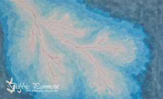
Last year the Make it Crafty gals set a challenge to colour lighting. Now I have to say it scared me when I read the challenge and I had to think long and hard about HOW to start. As I often tell people drawing is NOT a skill I can lay claim to - LOL. So how to create lightning????? I finally figured out a way so I thought I'd share it here with you.

Google is my friend - and I'm sure many of you can relate! I started the challenge by googling lightning images and finding this one which I saved to my computer. Print out the picture to the size you want.


Using some tracing paper trace the lightning - this does NOT have to be accurate - no-one will know where your original picture looked like and it's just used as a guide. You can orientate the lightning to suit your picture - in the picture I coloured for the original challenge I down-sized the lightning and pointed it upward - see below....


You'll see I finished the lightning off with some yellow in this picture - it has ALWAYS annoyed me that I took this extra step and you'll see I don't use it in this version! Now back to our lightning.... 


Transfer the lightning onto your colouring medium - use a soft pencil as you want to erase this line later. I start with the lightest colour to "set the scene". Make sure you place this as a border around your lightning line as you want to leave the lightning area white.


Gradually build out the colour and blend slightly. I find it easier to flick my colour towards the lighter colour as I'm fairly heavy handed and the hard edge where I start will be covered by the next and darker layer.


Keep adding your colours and blending lightly as you go. Then go backwards from darkest back to lightest to keep blending and adding definition to your lightning forks.


You don't need to get the the blending completely smooth - but you can see how much better it looks with a little bit of work.


When you are happy with the result erase the pencil marks and there you go - lightning! And don't you agree it looks much better without the yellow?!?!?!


Make it Crafty Products - 

Previous Picture MiC Products - 

Copics used - B0000, B000, B00, B02, B05, B06, B97