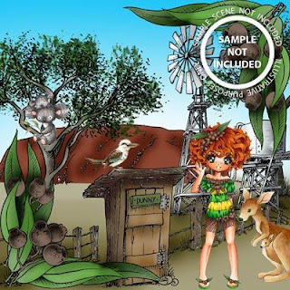
Make it Crafty has some fabulous background images all ready to use but with the "Elements Collections" that are available why be limited to the pre-made scenes??? The elements are sooo much fun to play with and so easy to use. I use a free-downloadable program called paint.NET to create my scenes in and I'm here to give you some ideas on how to work the "Elements" and then I'll show you the process of creating a simple scene so you can try it yourself!
There are LOTS of pictures so grab a cuppa and hope you get something out of it.
First up I want to show you how to fix up images and create clear backgrounds to overlay images easily. Most of Make it Crafty's images are already set up to go but there may be times you need to do this - for instance if you want to "clear" windows to put an image on the other side like in this example.
When you open up the image you will notice that part the background is a blue and white check - this means it will be clear when you overlay it onto something else. Where the image shows white behind the lines the image is opaque and will block out anything it overlays. To make my windows "clear" I select the magic wand tool and move it to the area I want to clear - I've circled it in red in the photo to above. Left click once your wand is in place and you will notice the selected area turns blue. Hit the delete button to clear all the blue areas.
You can see here I've done both windows as the blue and white check has replace the white background. Save your image in a .png format ready to use. NOTE - if you save in anything other than a .png format the white background will reappear.
Sometimes when you use the magic tool you will notice areas you DON'T want to clear change (see red circled areas above left). This is because the image has "open" lines which lets the magic tool in (see photo on right). Sometimes these openings are only a pixel wide so you may need to zoom in to look for them!
A simple fix for this is to select the pencil tool in the colour of your lines and draw a simple line in to close the space. Once the image is coloured you won't even see this line. BE AWARE that some stamp companies classify this as "altering images" though - but Zoe is more than OK for you to do this if you need to with MiC images.
When clearing your background don't forget the little areas - circled in red here. And notice I forgot to close the lines on the newspaper - will go do that.....
Other Tips
- If you want to add elements into your scene that are facing a different direction to the way they come you have to flip them to suit BEFORE adding to your scene - so just open a new page in your paint.Net, open the image and use the image tab to flip your image either vertically or horizontally. Once you've "saved as" "flipped" in your files you can then import it into your scene.
- Work from back to front as you layer in your elements.
- Make changes to each step of your image before uploading the next element - once you move on you can't change previous elements without using the "back" key and erasing any subsequent work. And some changes may need to be made and saved prior to uploading as mention before re "flipping".
- I sometimes save scenes "mid-way" and then keep working. It means I have the beginning of a different scene OR a back-up to where I last liked what I had done ;).
- To resize elements just "grab"the edges or corners of your image and "drag" them to the right place. Move elements the same way - with your mouse hovering over the centre of the image.
- Use the ZOOM to get in close to your work if you need too.
- ALWAYS use SAVE AS when saving your work so you don't save over original digis.
And now you know those tips let's create an easy scene!
I want to mix up Paris Elements and Urban Elements to create a romantic backdrop for my image. You need to work from the back to front and so I started with the Eiffle Tower. I opened it up into my paint.NET software and got to work.
The first thing I wanted to do was make the Eiffel Tower look like it was sitting in the distance - so I didn't want it to be as clearly printed as the foreground of my image. I opened the "brightness/contrast" button and set the brightness to 73 which lightened the lines.
Then I needed to increase my canvas size to fit on my other elements. Don't worry if you get it too big - you can crop it down later. Use the "canvas size" button under the image tab to do this. You can check the space you have and your placement of your first image before moving on. If the canvas is too big or small just go back and change it.
Since I want to overlay my finished scene onto some digital designer paper I made the whole area clear using the "magic tool".
To add in scene elements use the "import from file" button under the "layers" tab. This opens up your files so you can find and load in your next element.
I'm adding in the wall from the Urban Elements (I love this wall!!!). The file for this image is bigger than the canvas you have set up so it makes the canvas bigger to fit. Once again you can crop if you need too AFTER the element is on place.
The wall has now been resized and moved into position and now I have to use the magic tool to clear the left hand side so a white line isn't left when I overlay it later. Just use the tips above to do this if you need too.
I then laid in the footpath from the Urban Elements. This was design to be used as part of a wall so it has cracks going up the wall (red circled areas). I don't have a wall there so cracks would look out of place. I simply used the eraser tool to remove them before continuing on. Once again - BE AWARE that some stamp companies classify this as "altering images" - but Zoe is more than OK for you to do this if you need to with MiC images.
I then start adding in the Paris Building Elements I need to create a stone balustrade.
I layered in and resized one pillar to suit and then used the "duplicate layer" button to replicate it in the same size so I didn't have to worry about getting it right. The new image is layered in right on top of the orginal you are duplicating so just grab it and move it into place.

I then layered in a fancy top and re-sized to make it fit across the pillars
I decided to just add a simple top to the rest of the balustrade but it sat over the wall on the right and overhung my canvas on the left. I simply used the eraser to remove the section sitting across the wall and didn't do anything with the bit on the left - it's removed when you move on.
I adding in a small touch of Ivy to the base of the wall for interest and then popped in my characters. I had flipped this image previously to orientate them the way I wanted. I then saved my image as a .png file to keep the clear background. There are 2 steps to saving - just follow the instructions and "flatten" when asked - this just removes all the layering and turns your work into a single image.
I wanted to cheat a little with my background so used a digital DP that looks a little like a romantic sunset - what more could a young couple in love want in Paris - LOL. And THIS is why I wanted to keep my background clear. To do this simply open up your digi DP and then layer in your image. You can do this in Word too if you like.
And here is the finished card - just needed to do a bit of colouring and embellishment.
I hope you've found this useful.
Make It Crafty Digi Images -
Note - you can buy the FULL set of Paris Elements
HERE
Make it Crafty Chipboard -
Make it Crafty Rubber Stamps -
Copics Used - Skin (E21, E13, E11, E000, R20, R11) plus E42, E41, E40, E19, E18, E08, 100, T8, T4, T2, T0, Y35, Y15, Y13, Y00, Y000, B99, B97, B95, B93, B91, G28, G24, BG78, YG61, YG01, R24

.jpg)


